Heart It Out
Live Project
Designed physical products that would constitute a mental health care package
Info
Team
Type
Client project
Role
Product Designer
Timeline
1 month
Focus Area
Product Design UX Research Product Strategy Illustrations
The Summary
The brief was to design physical products that would constitute a mental health care package, featuring the Periodic Table of Emotions and a zine offering insights into managing anger and promoting emotional well-being.
my role in this project
I was the Product Designer on this project, working closely with psychologists, psychiatrists, and mental health professionals to find the best approach for both the design and content that truly resonated with the customer base.
Design approach
Our main goal was to create content and visuals that were both engaging and soothing for the clients. We kept the design clean and simple, but added a unique touch by using bold accent colors sparingly. The core elements remained light and minimalist.
Our focus was on impactful copy, thoughtful illustrations, and the overall layout to ensure the products were visually appealing and user-friendly.
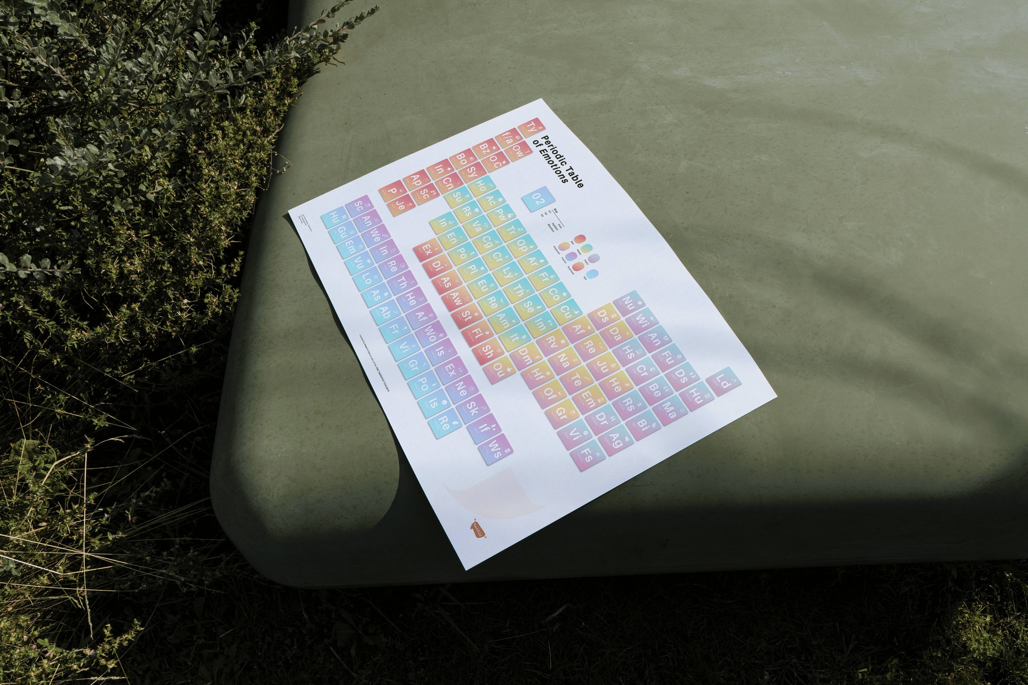
In the initial phase, we selected the Periodic Table of Emotions and the Angry and After zine to be included in our product packages. Both items were successfully sold to clients and distributed as part of corporate gifts during company events.
PART I
Periodic Table of Emotions
So, what is a periodic table of emotions?
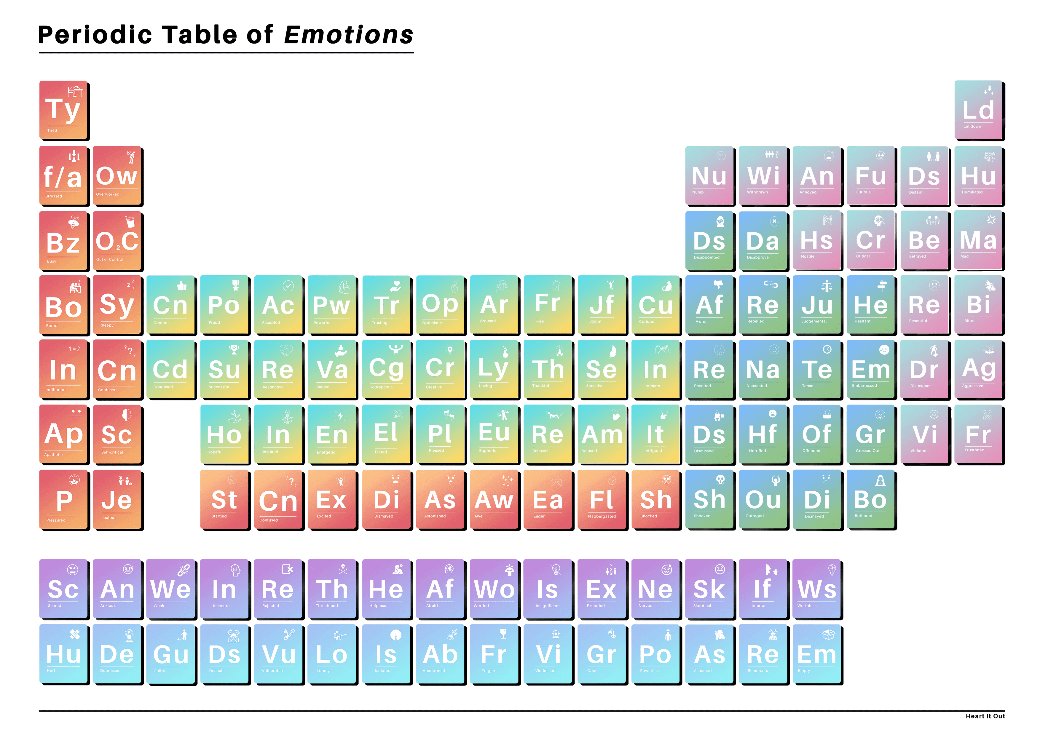
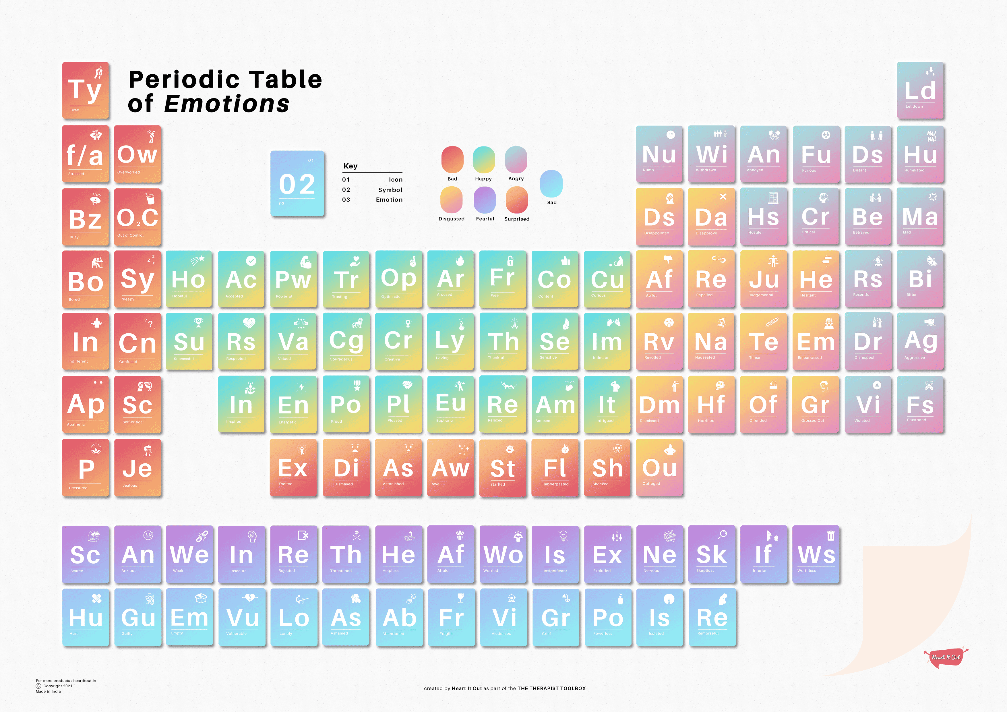
The periodic table of human emotions is a simple, engaging tool inspired by the periodic table of elements. It helps people better understand and identify emotions, promoting emotional intelligence.
Designed for clinics, schools, or even homes, this poster encourages individuals to name their emotions—an essential first step in understanding and managing feelings in a healthy way.
How did I approach designing the table?
To kick off the design process, I had several discussions with mental health professionals from the organization to understand the scope, the emotional spectrum, and how best to represent it visually. We agreed that using the structure of the periodic table would be the most effective approach.
Next, we worked on grouping the emotions into categories, selecting a color scheme for each section of the spectrum, and defining tonal variations for each emotion within those groups.
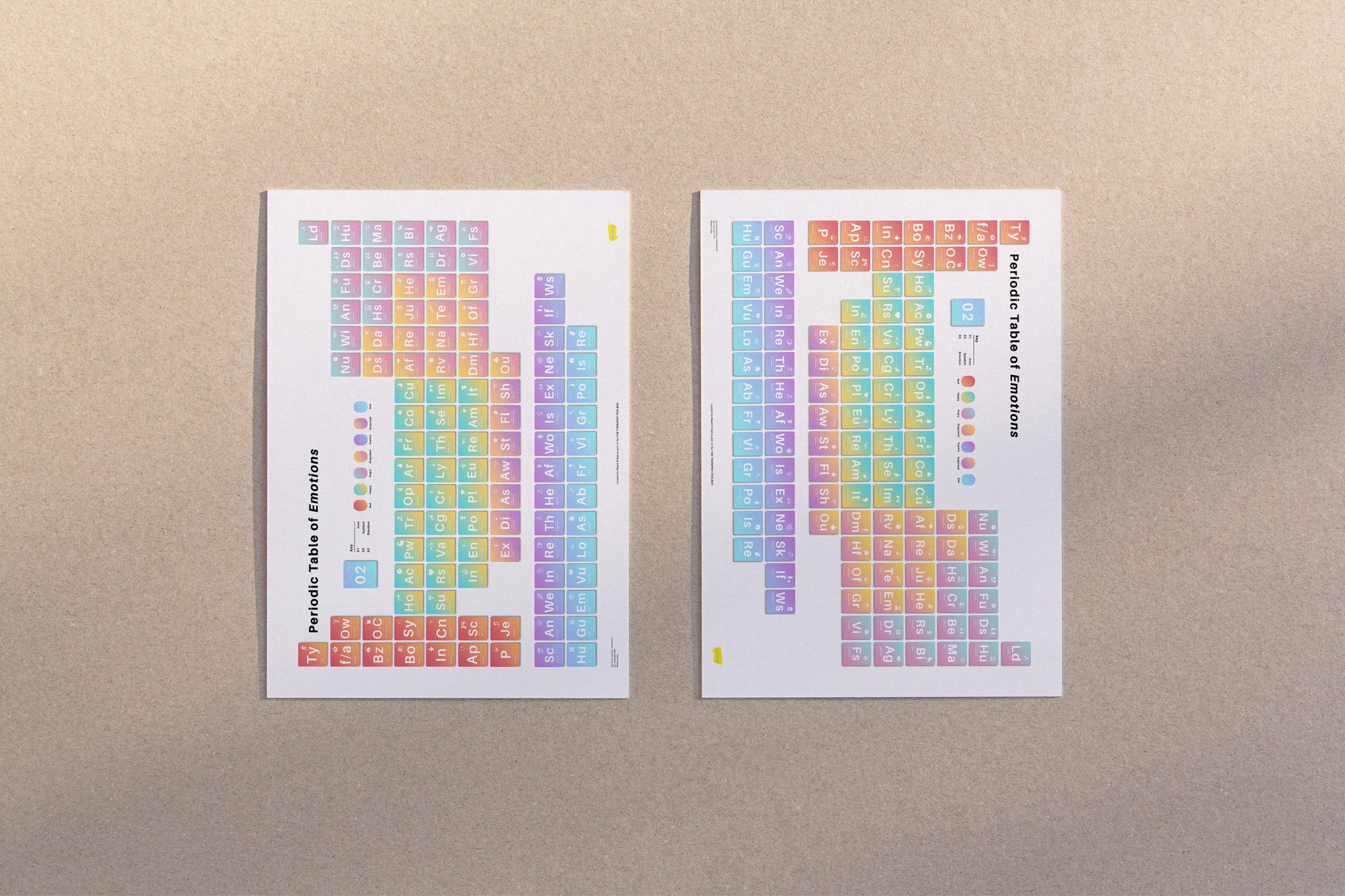
Using the elemental table structure allowed us to organize emotions
into distinct categories while keeping related emotions side by side.
This setup maintained smooth tonal transitions, making it easier to differentiate between similar emotions.
PART I
elemental iterations
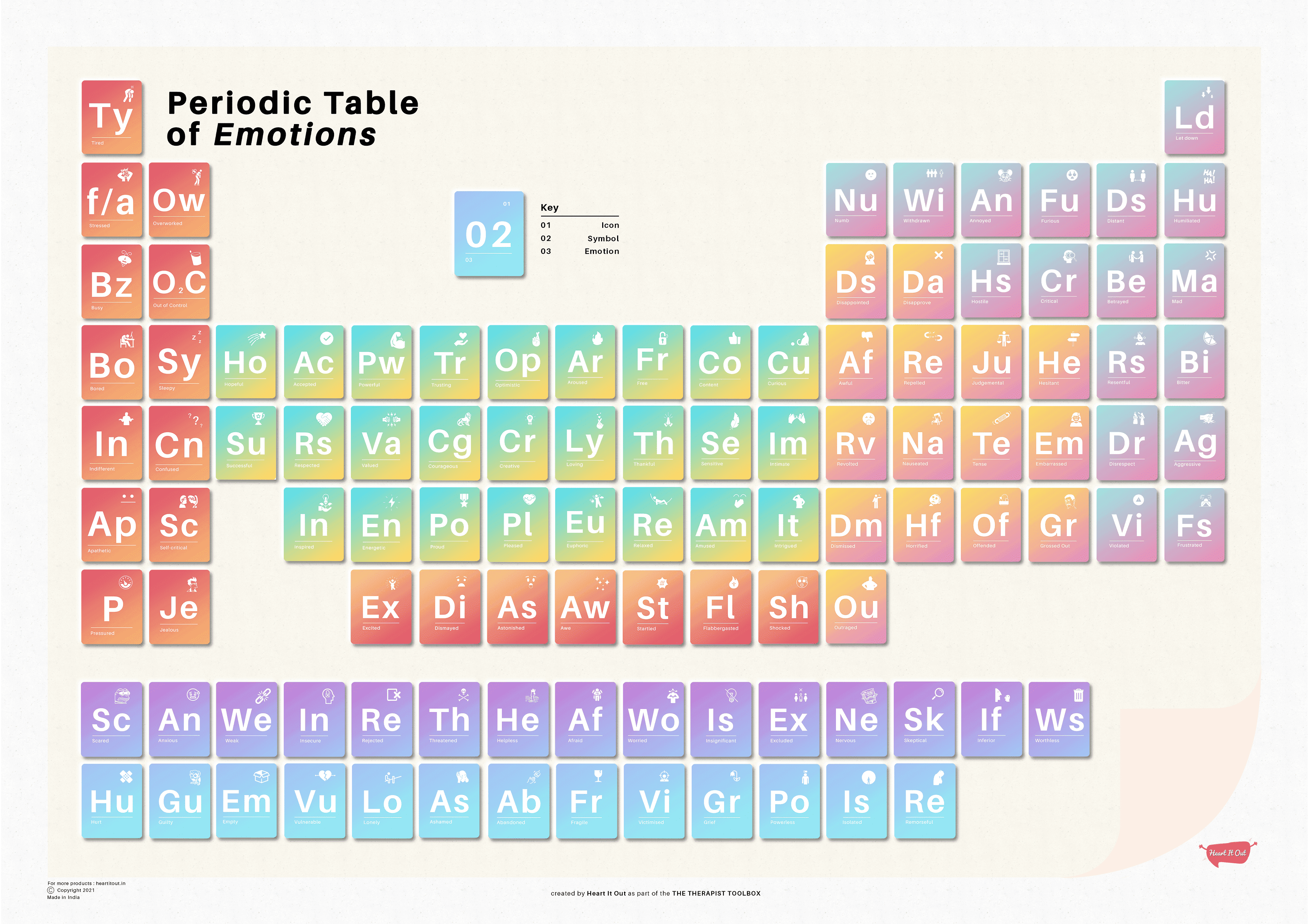
The most critical part of the table was designing the individual cells. Each of the 106 emotion elements needed to be distinct and easy to understand. We went through several iterations for each element, refining the design until we achieved the perfect balance of clarity while effectively conveying all the necessary information.
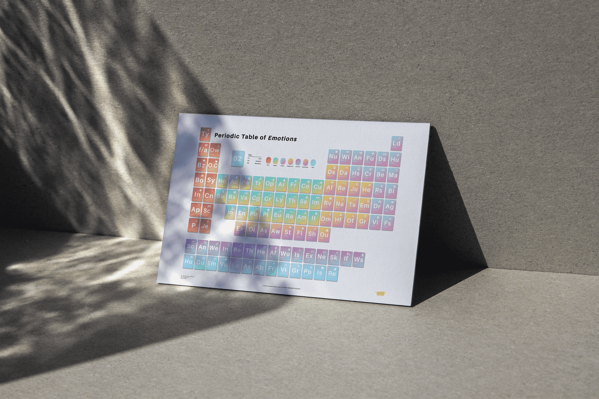
We explored several iterations for the table’s structure before settling on the version that was the easiest for anyone to understand. The poster was produced in A3 size, making it convenient to package and display in various settings.
PART II
Angry and After
Zine
THE SUMMARY
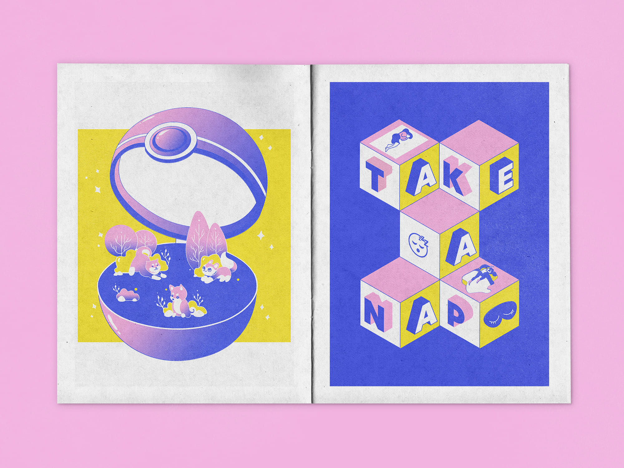
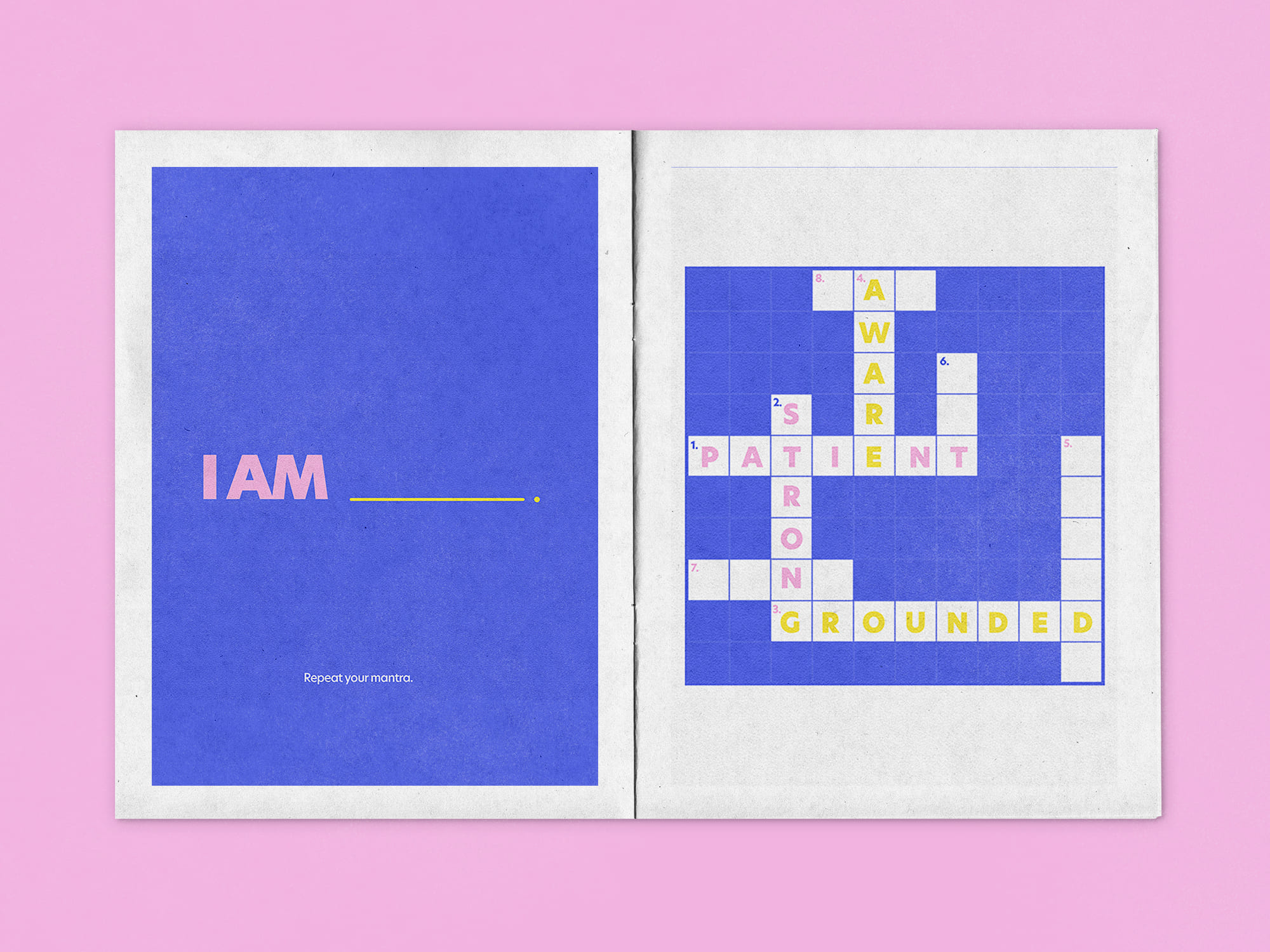
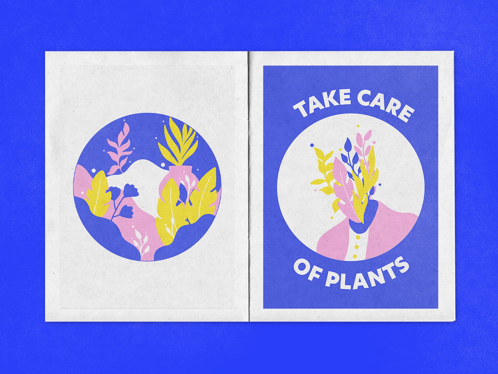
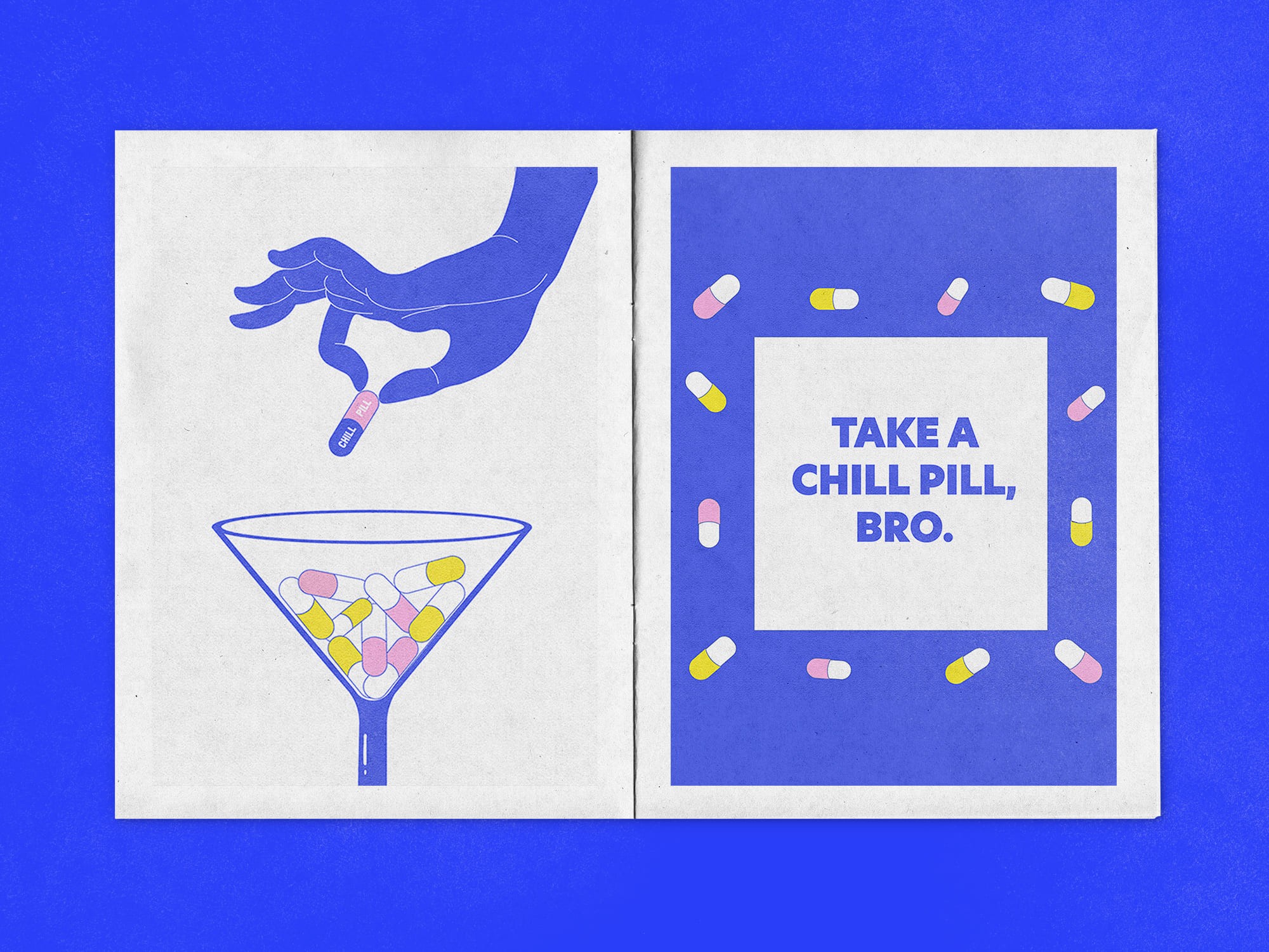
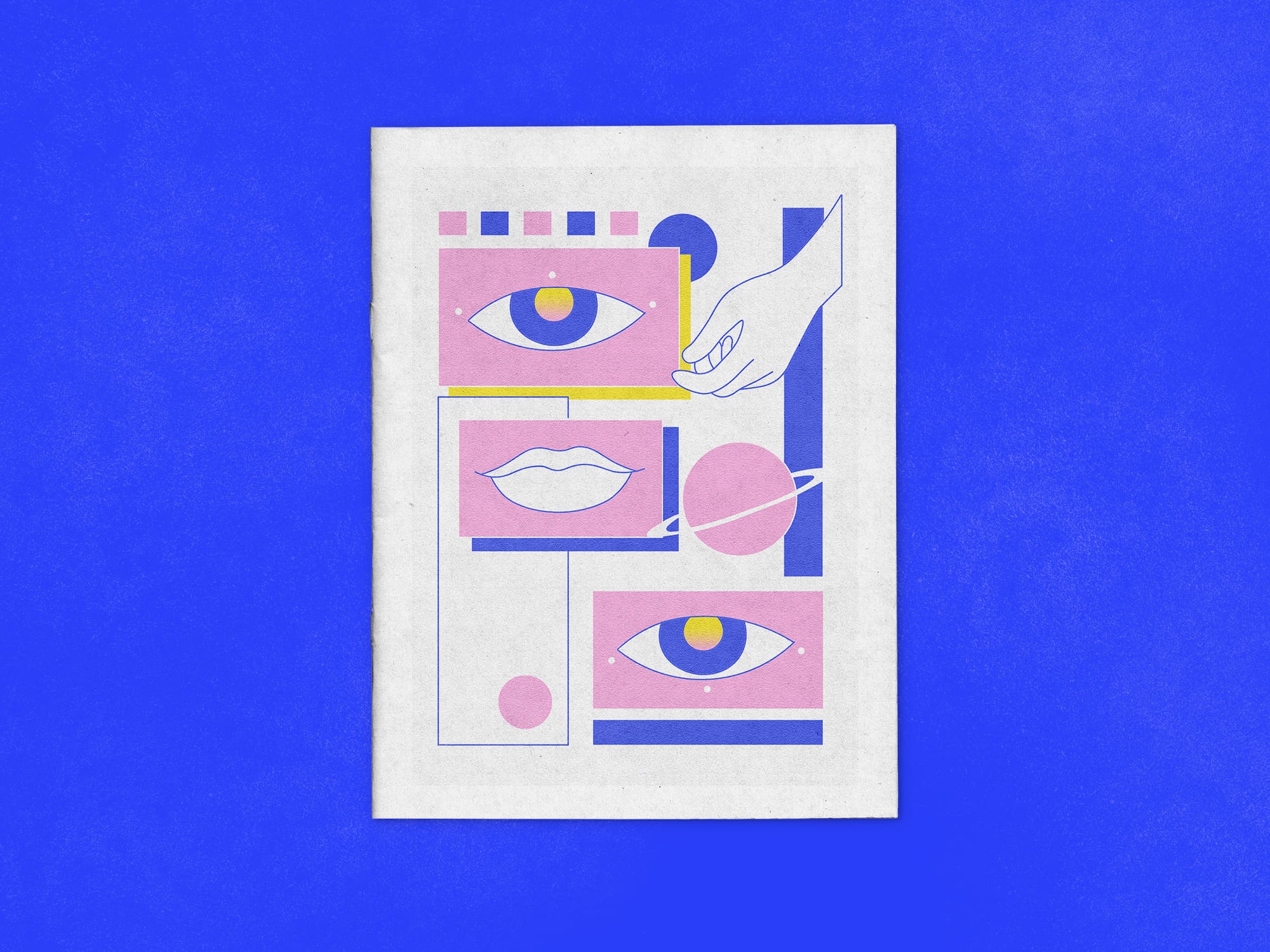
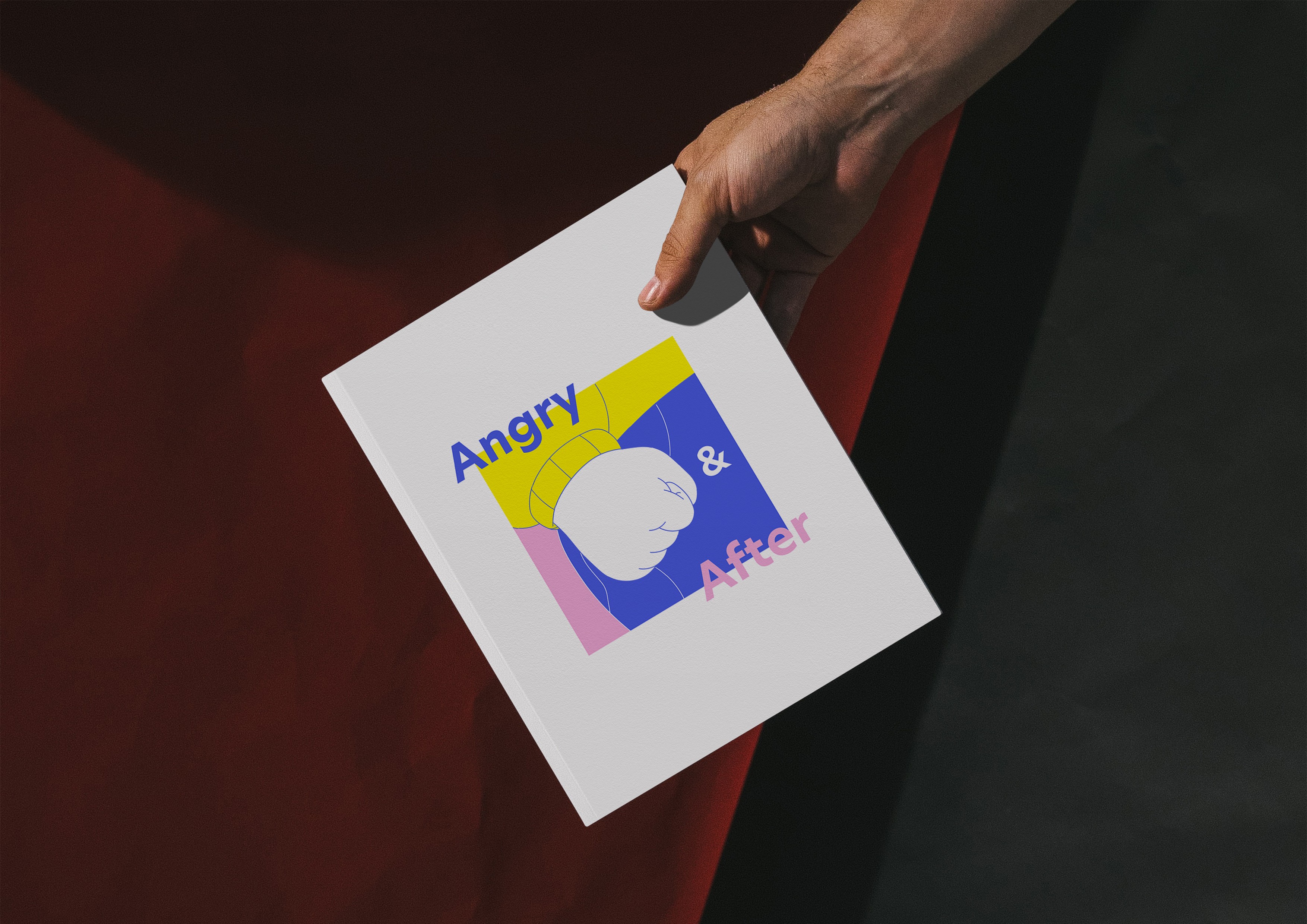
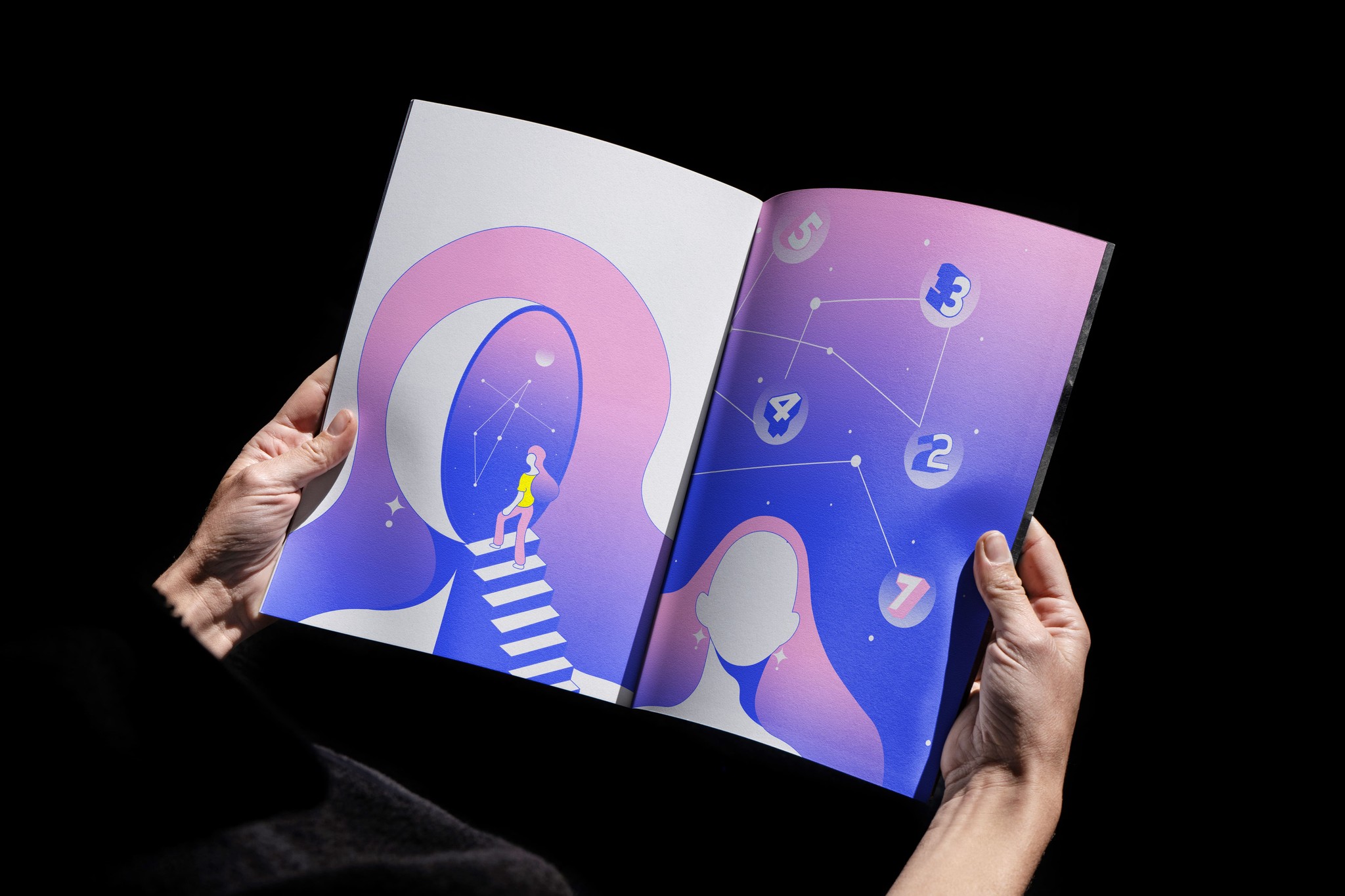
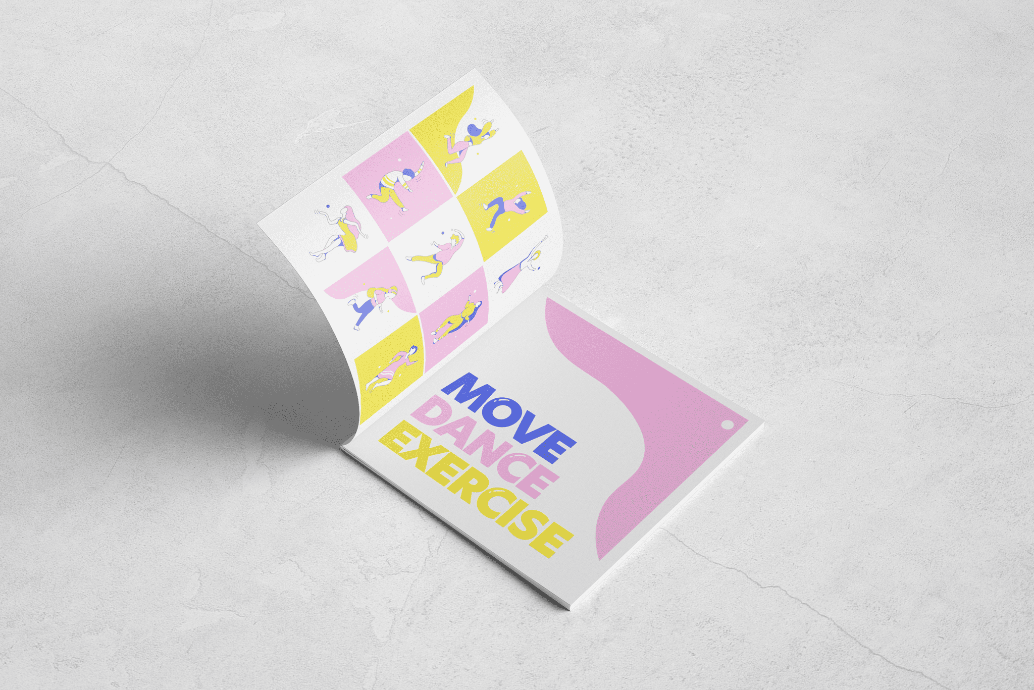
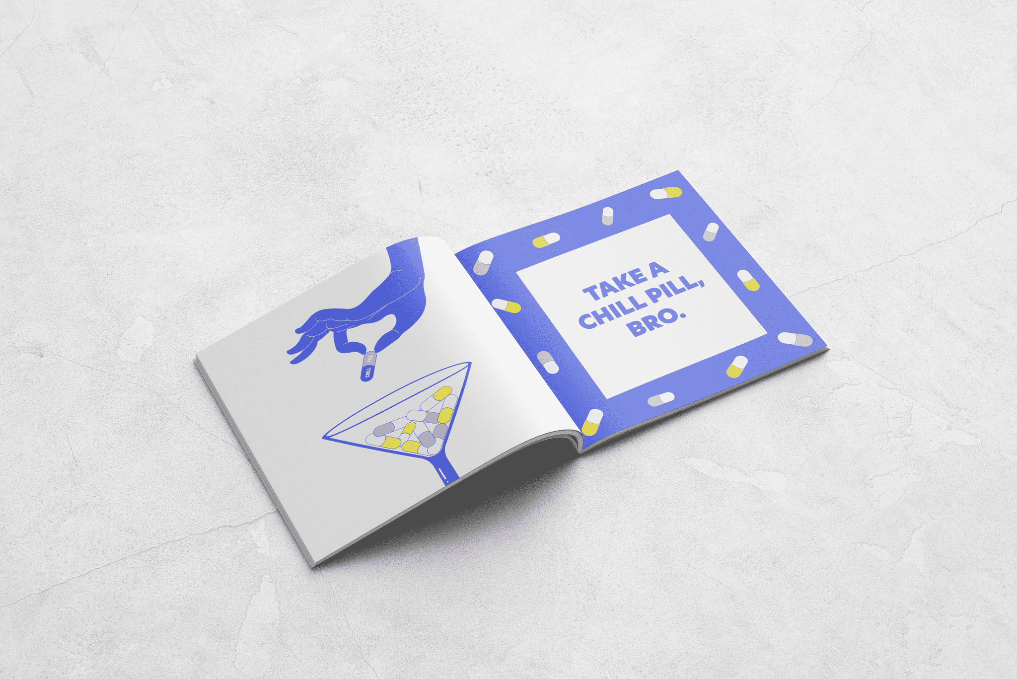
This zine was designed to help users create new habits to deal with their anger in a healthier manner. It comprises of a curation of advice backed by eye-catching illustrations that would aid the user in their moments of outbursts.
What was our design process?
We began by brainstorming advice from psychologists on managing anger issues. This led to the creation of catchy taglines, which became the foundation for the conceptual sketches developed for each tagline.
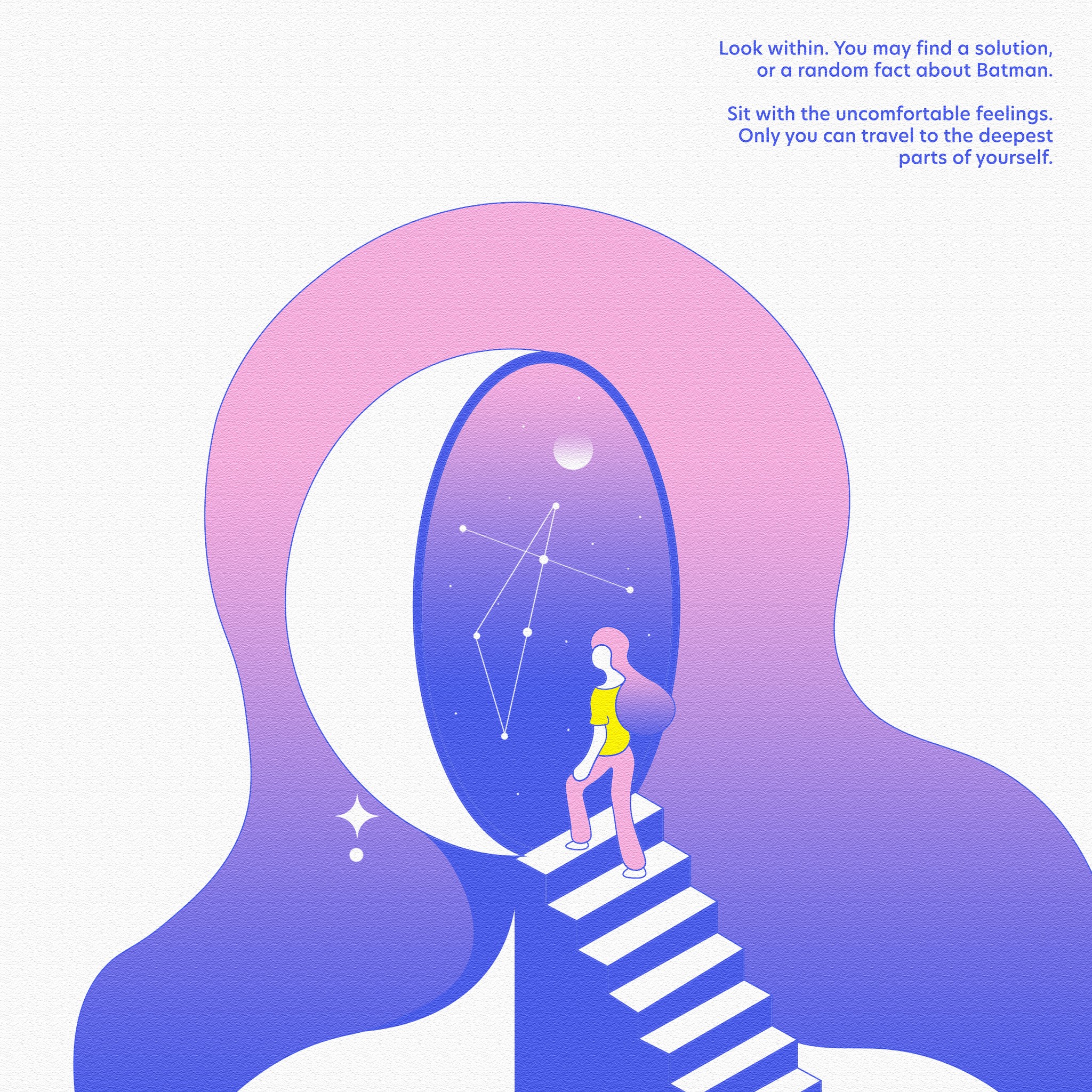
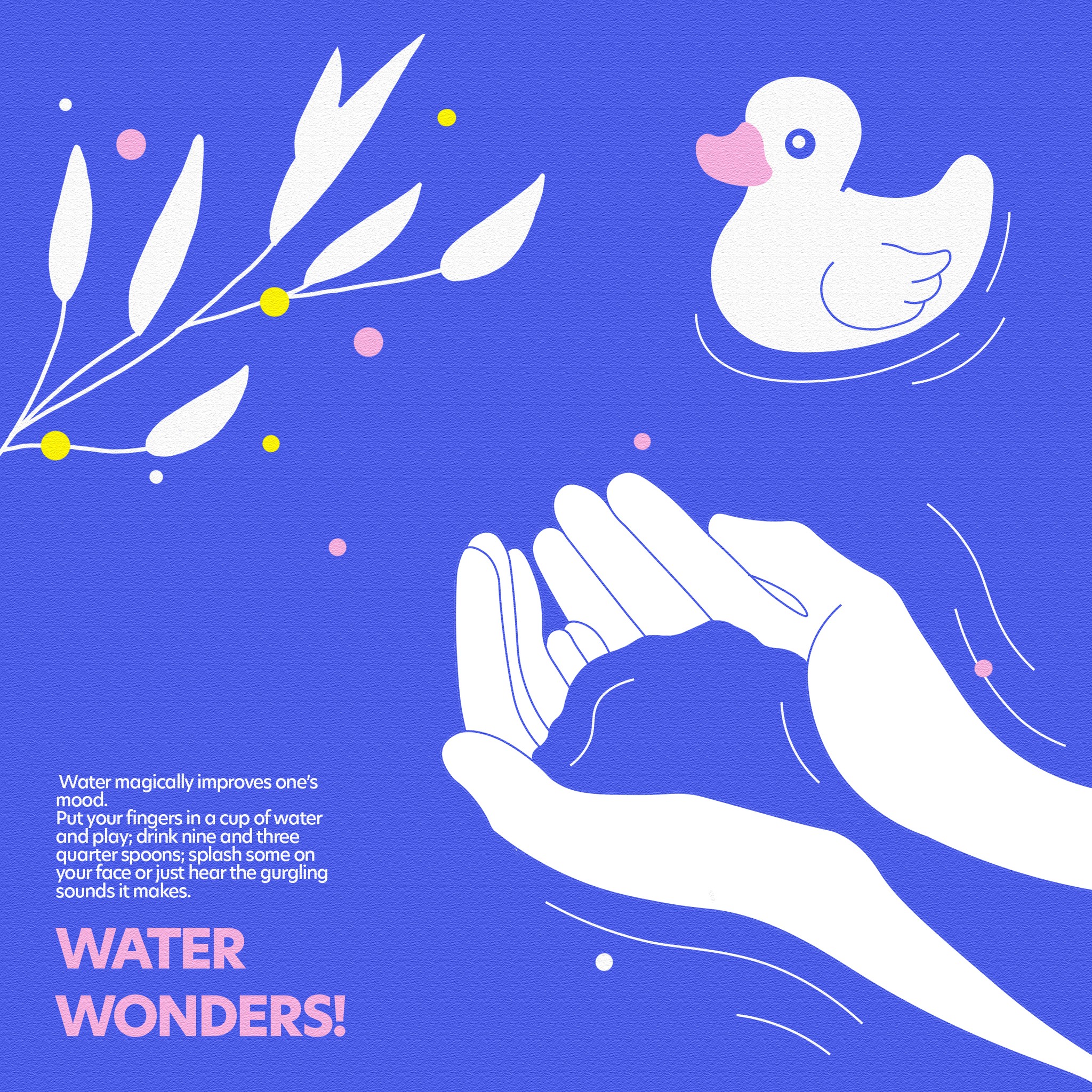
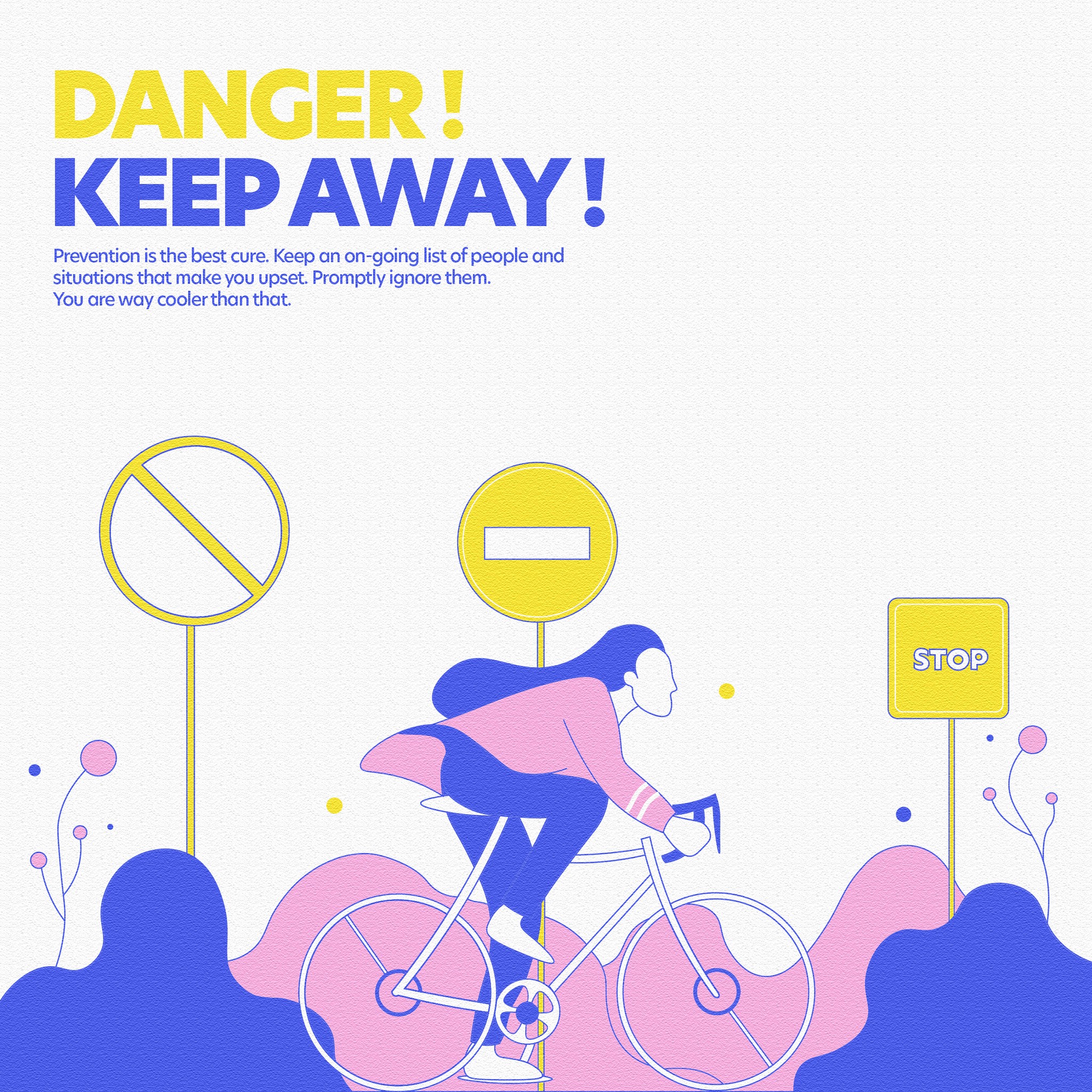
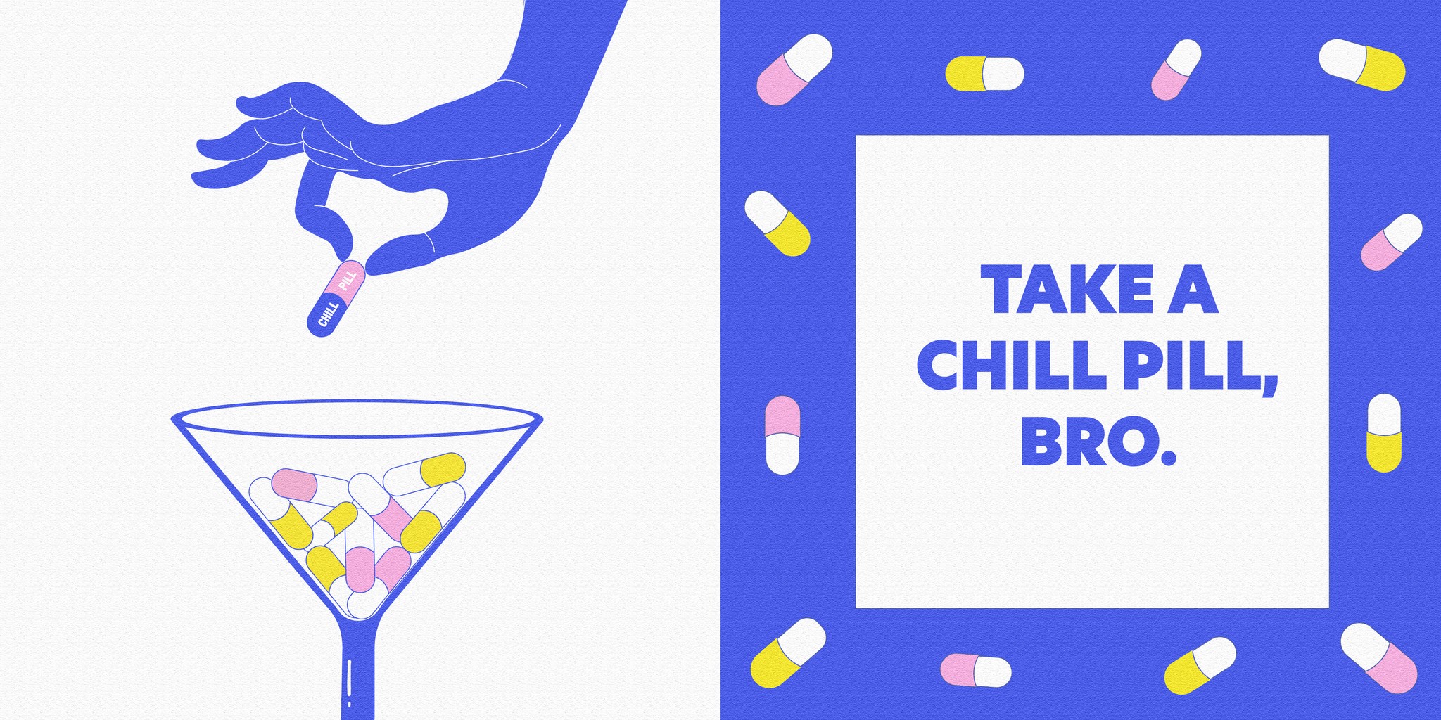
Each illustration underwent multiple reviews and thorough checks to ensure the visuals were inclusive, calming, and non-triggering for clients who might be experiencing intense emotions when they engage with this zine.
Signing off : retrospective
This project was a valuable learning experience as one of my first as an independent designer. I loved collaborating with experts from various fields and turning their insights into impactful design elements. Special thanks to Nithya from Heart It Out for giving me full creative freedom throughout the process.
Hi there!
My portfolio is best viewed on a laptop 🖳 for now!
The mobile version is still in the workshop, but it’s coming soon—stay tuned!


Hi there!
My portfolio is best viewed on a laptop 🖳 for now!
The mobile version is still in the workshop, but it’s coming soon—stay tuned!
